本视频教程是由Udemy机构出品的Illustrator风格化信息图表矢量制作视频教程,Digital-Tutors Creating and Stylizing Statistical Information in Illustrator,时长:1小时22分,大小:260 MB,MP4高清视频格式,教程使用软件:Illustrator CC 2015,作者:Alex Hernandez,共11章节,语言:英语。
Adobe Illustrator是一种应用于出版、多媒体和在线图像的工业标准矢量插画的软件,作为一款非常好的图片处理工具,Adobe Illustrator广泛应用于印刷出版、专业插画、多媒体图像处理和互联网页面的制作等,也可以为线稿提供较高的精度和控制,适合生产任何小型设计到大型的复杂项目。
Digital-Tutors机构是号称全球最大的CG付费教程网站,2000多万次视频播放记录,顶级客户的优秀项目实例,被誉为教学和娱乐结合的最好的教程,RenderMan创建人称之为“完美的学习站点”,成立至今已经有12年之久,内容集中在视频制作和游戏制作两大板块,其网站完整的教学的理念,先进的技术支持(他们甚至开启了移动手机看教程的计划,支持IPAD/IPHONE/ANDROID),都让人耳目一新。尤其是多层级的教学难度设置,有趣的考试内容,时不时的竞赛,让DT成为非常活跃的一个CG机构。
Digital-Tutors Creating and Stylizing Statistical Information in Illustrator
In this Illustrator tutorial, we’ll be using graphs and charts to visualize data and learning how we can customize them to make them more appealing.
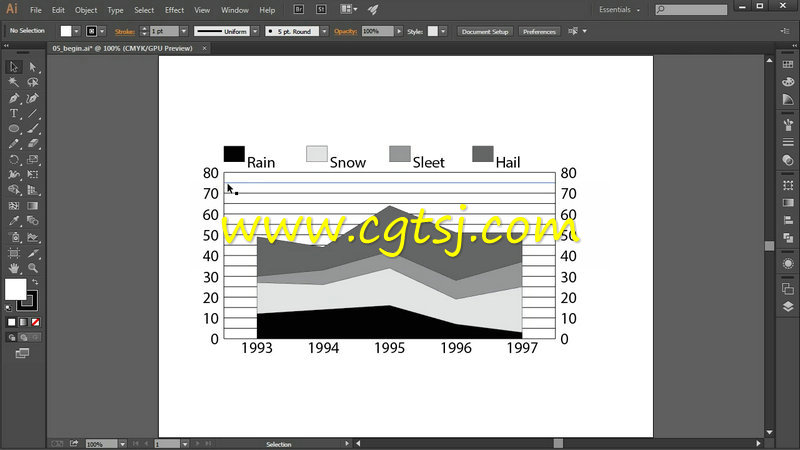
We’ll start by getting familiar with a pie graph and learn how we can enter data into the worksheet to see results in our graph. We’ll then move onto column and area graphs and learn what a data set is and how to translate it into our graphs.
Next, we’ll learn how to get our graph’s legends and labels to look intentional. We’ll also combine different graph types in the same visualization and learn how to format color and type for our graph.
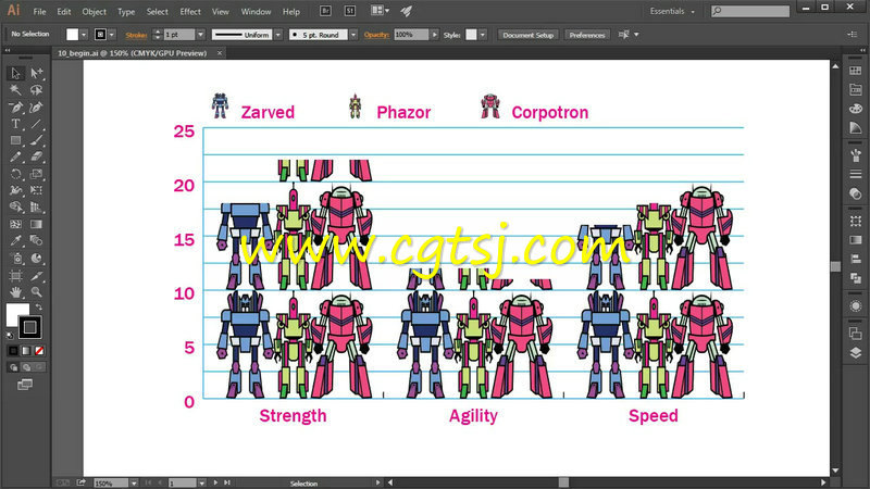
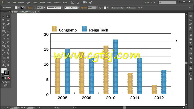
We’ll wrap up this tutorial by learning how to use graphics in place of columns, markers in our graphs and how we can customize the appearance of our graphics to get the best result.
By the end of this Illustrator training, you’ll have a variety of tips and tricks under your belt for the next time you need to add great-looking graphs in your designs.